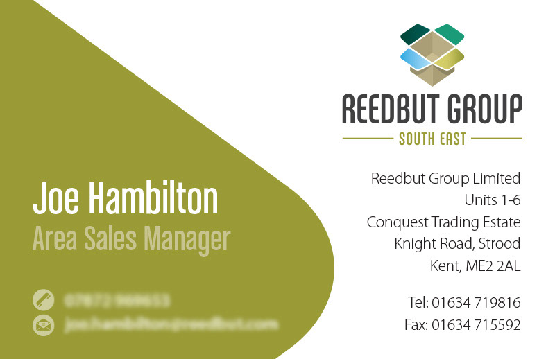
Branding for the Reedbut Group
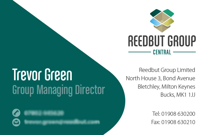
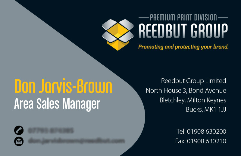
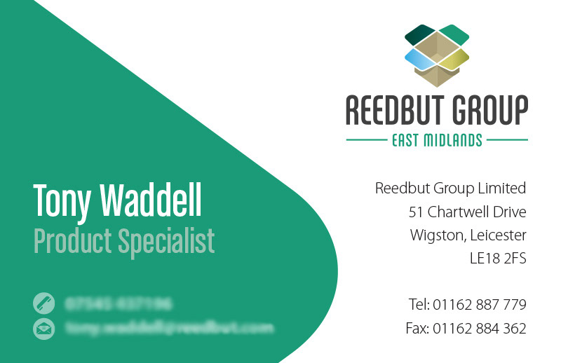
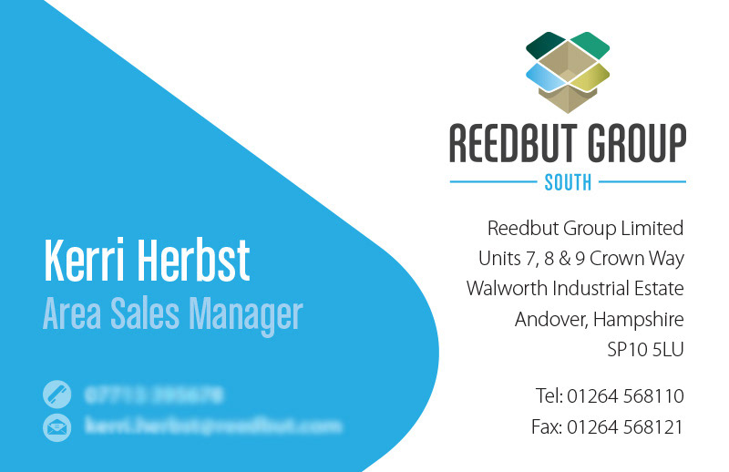
We have worked with Reedbut since around 2006. In 2016, they amalgamated their operations under the 'Reedbut Group' and asked HK Designs to create the branding. Reedbut make boxes — that had to be clear. They have four geographical locations. The tabs on the box point as compass points and the colours relate to the previous logos for each of these. The 'Premium Print Division' had to be in-keeping, but clearly different. Available at all locations, a more simplistic and striking colour palette was used.