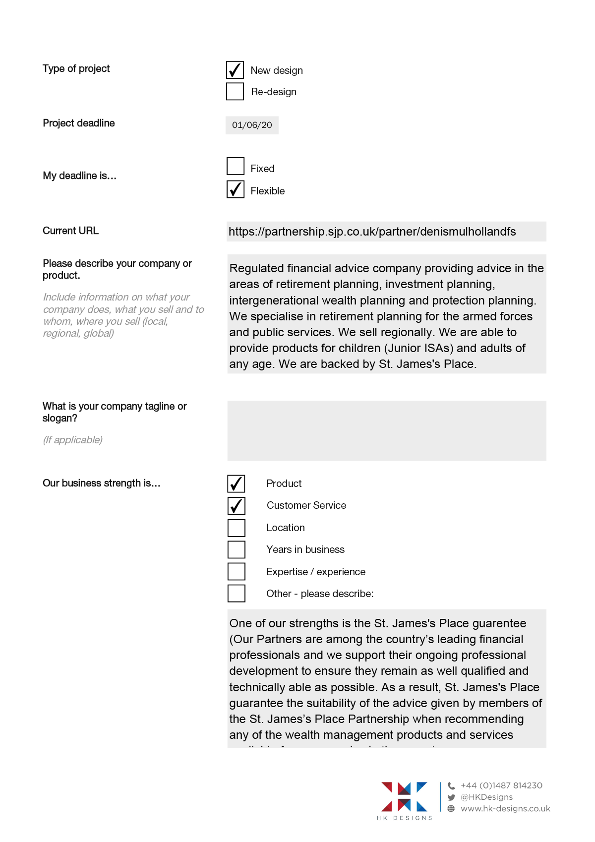
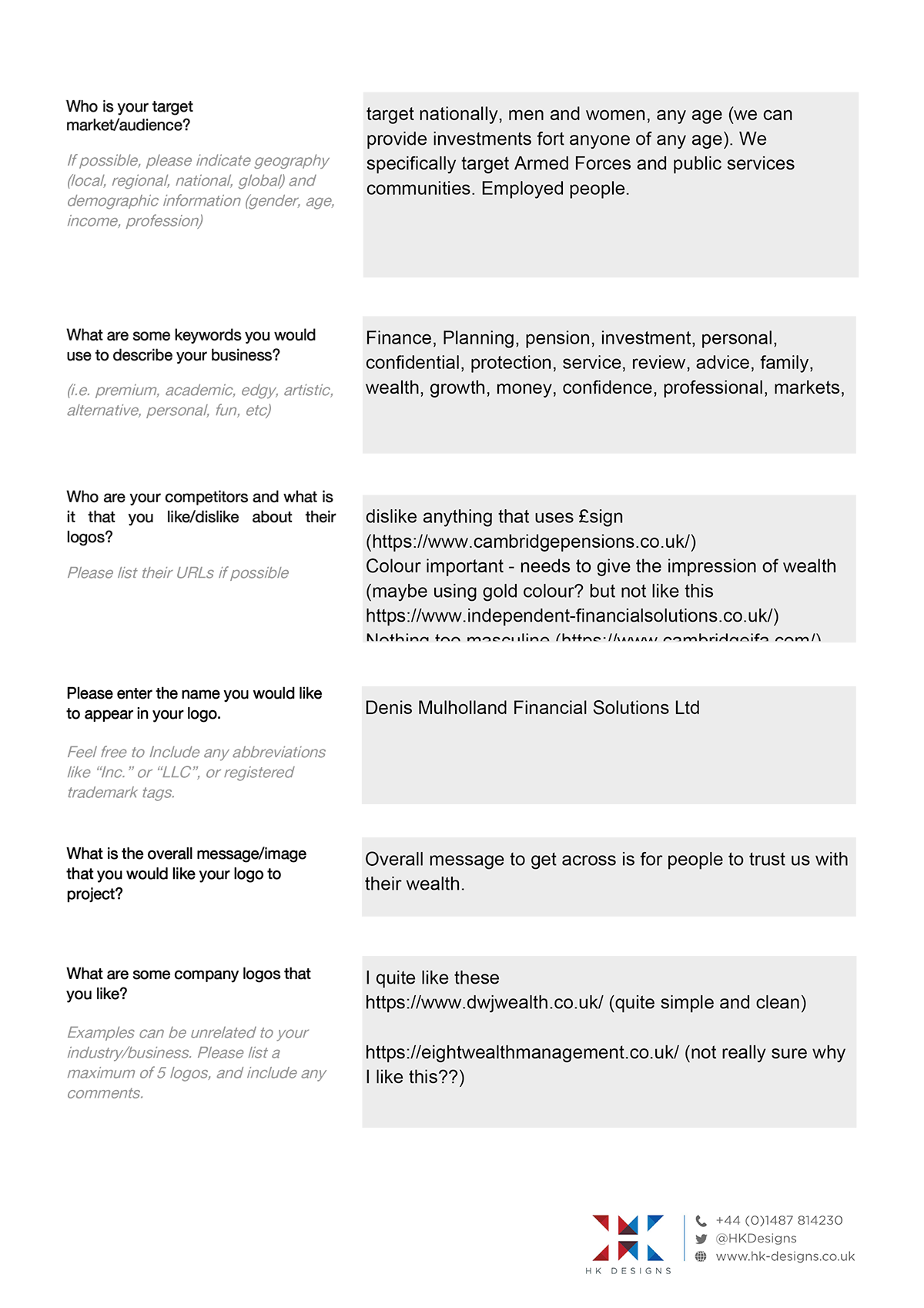
We supply a questionnaire form for clients to complete.
This gives us a more comprehensive and considered brief, and one we can refer to throughout the project.
From an evaluation of the information provide, a process of research and idea collation begins.
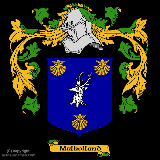
In this instance the name 'Mulholland' was researched, and included a family crest featuring shells and a stag.
As this is a personal, relationship based business, it seemed appropriate to consider using these elements to form part or all of the logo design.
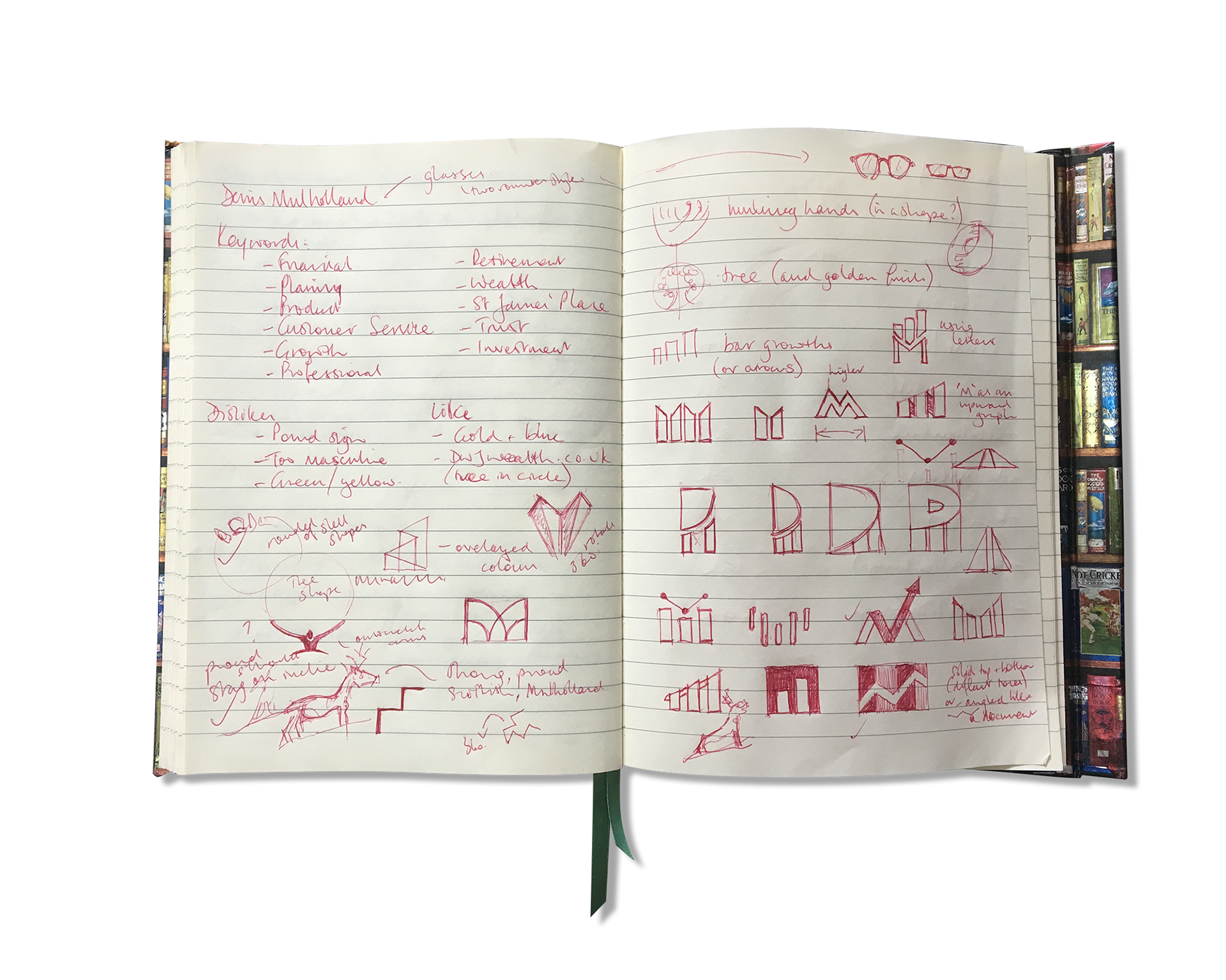
A typical page of my notes and sketchbook showing some initial keywords, thoughts and rough visuals.
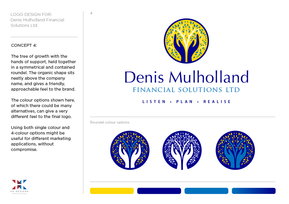
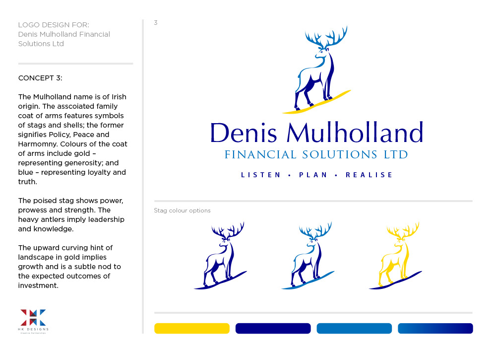
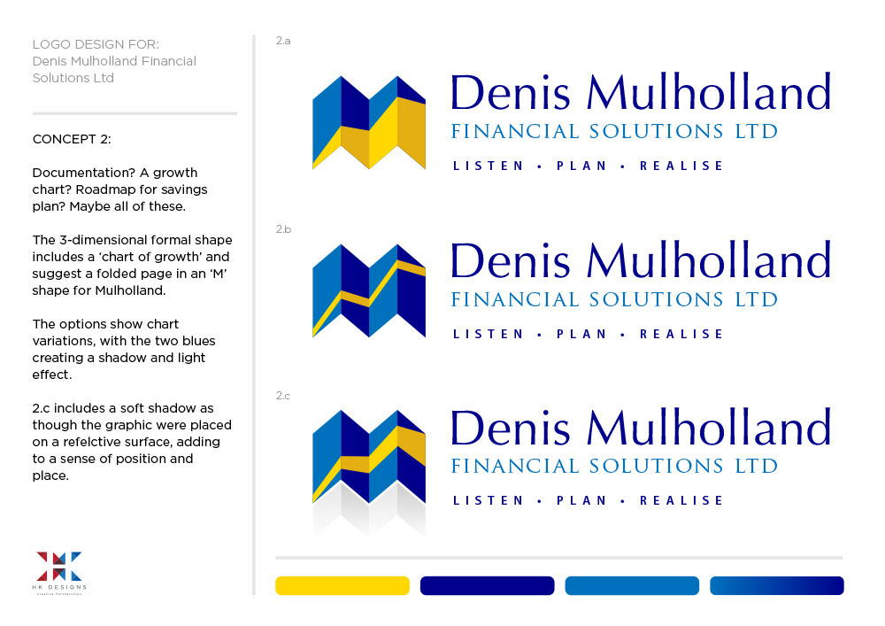
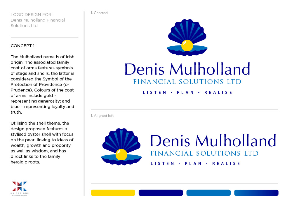
The presented document of ideas, showing 4 concepts – 2 related to the coat of arms, and 2 related to ideas of growth.
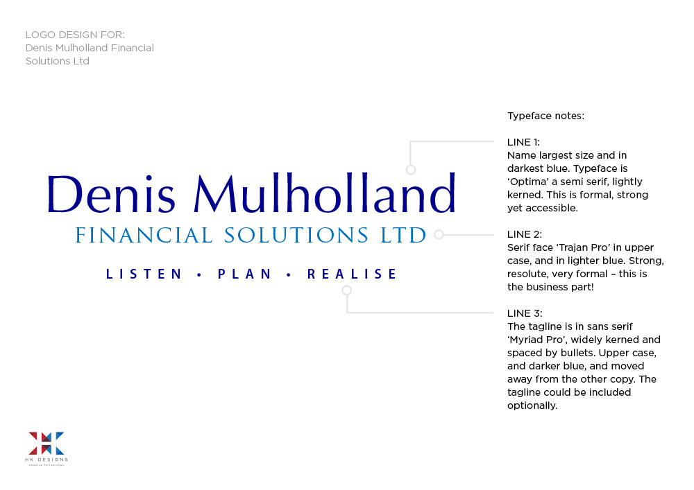
A note that the typefaces used are carefully considered in their style, weight, size, colour, case and kerning (spacing).
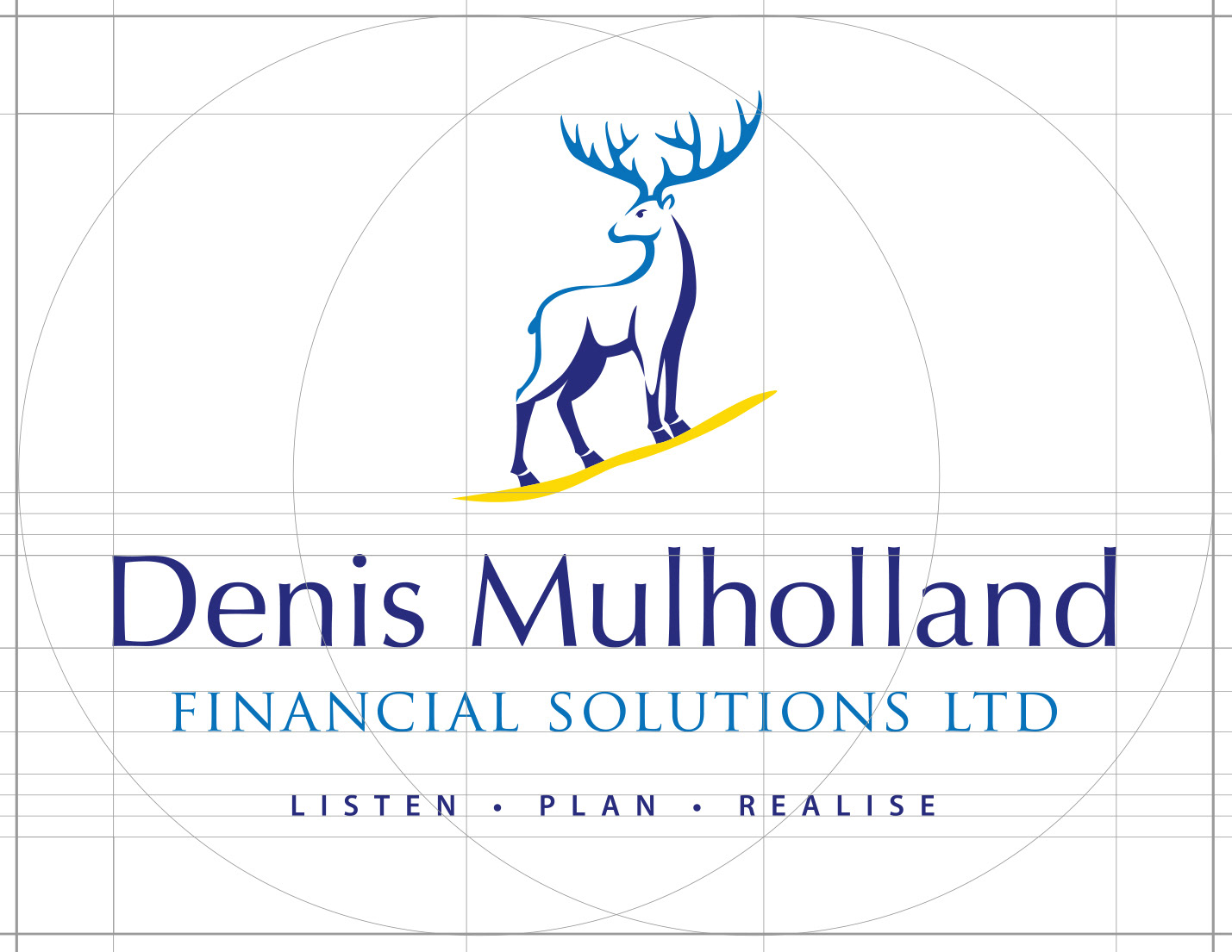
Refining the chosen logo and using a grid to get alignments and scale balanced.
The chosen logo featured a stylized stag poised proud and strong. It stands on a mountain slope in gold, a visual nod to investment growth and the aims of the business. A simple palette of 3 colours is used, creating a link between image and type, and adding a sense of depth in the icon. The type used is conservative throughout in-keeping with the nature of the business.
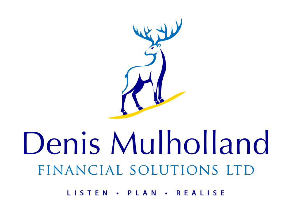
The final logo is supplied in various file formats.